TPT
Total:
$0.00

Scatter Plot Project

Rated 4.5 out of 5, based on 2 reviews
4.5 (2 ratings)
;
Teachers Making Math Fun
7 Followers
Grade Levels
7th - 10th
Standards
Formats Included
  • Zip
Pages
6 pages
$3.00
$3.00
Share this resource
Report this resource to TPT
Teachers Making Math Fun
7 Followers

Description

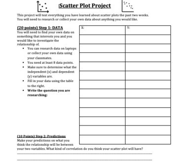
This is an awesome research project that is summative assessment for a Scatter Plot unit.

For this project students are asked to pick a research question about bivariate data, gather the data online or through a survey. Next, they will make a prediction, construct a scatter plot, draw a line of best fit, find the equation of a line of best fit, and answer analytical questions about the data by interpreting the scatter plot.

This is a great project that will allow students to utilize technology to research a topic of interest. This will also test their understanding on all parts of scatter plots, including all 8th grade content standards under probability.

My students loved this project and were engaged during class time. It was interesting for them and allowed them to be creative on what they enjoyed.

This product contains 3 different documents. This includes:

1. Bivariate Data Examples: A range of different interesting topics/questions for students to use for this research project. (1 page)

2. Scatter Plot Project: The project itself which is described above. (4 pages)

3. Rubric for the project. (1 page)

The product is a zip file of 6 documents. Each of the 3 worksheets described above is given as a PDF AND as a word document so you can print right away or edit it as you please (since the point values are indicated on the project and you may want to change them!)

I hope you enjoy this project!! Let me know what you think.

Total Pages
6 pages
Answer Key
Rubric only
Teaching Duration
N/A
Report this resource to TPT
Reported resources will be reviewed by our team. Report this resource to let us know if this resource violates TPT’s content guidelines.

Standards

to see state-specific standards (only available in the US).
Construct and interpret scatter plots for bivariate measurement data to investigate patterns of association between two quantities. Describe patterns such as clustering, outliers, positive or negative association, linear association, and nonlinear association.
Know that straight lines are widely used to model relationships between two quantitative variables. For scatter plots that suggest a linear association, informally fit a straight line, and informally assess the model fit by judging the closeness of the data points to the line.
Use the equation of a linear model to solve problems in the context of bivariate measurement data, interpreting the slope and intercept. For example, in a linear model for a biology experiment, interpret a slope of 1.5 cm/hr as meaning that an additional hour of sunlight each day is associated with an additional 1.5 cm in mature plant height.
Understand that patterns of association can also be seen in bivariate categorical data by displaying frequencies and relative frequencies in a two-way table. Construct and interpret a two-way table summarizing data on two categorical variables collected from the same subjects. Use relative frequencies calculated for rows or columns to describe possible association between the two variables. For example, collect data from students in your class on whether or not they have a curfew on school nights and whether or not they have assigned chores at home. Is there evidence that those who have a curfew also tend to have chores?

Reviews

Questions & Answers